Published on November 20th, 2020
“Hey Google, show me my search history.”
If you are like me, you Google just about everything from weather to conversions from tbsp to cup, how to feed a sourdough starter, TSLA stock, where is the nearest bar, and the list goes on and on. So when I stumbled upon a blog post explaining how to explore your own Google search activity on https://towardsdatascience.com, written by Saúl Buentello, @cosmoduende, I knew I had to take a stab at analyzing my own search history.
I won’t go through the steps to generate your own Google search history extract, Saúl does a fantasic job walking you step-by-step through Google’s Takeout service in his blog Here. That being said, make sure to poke around the complete Goole’s Takeout service. These days, tech companies collect troves of your data, but they are also making it more accessible. It’s important to understand what data they collect, how to restrict data collected on you, and how to utilize it for yourself!
I will pick up from Saúl’s blog where he begins to load libraries and read the Google Takeout data. I already have some experience with text analysis from my YMH two-part blog series and I’ve picked up a lot of tricks from that project. Because of my prior experience, I will be making changes and, what I consider, improvements to Saul’s code below and adding more complex text analysis as well.
Setup and data work
As always, we’ll make use of the {pacman} package to load, install, and update the libraries we’ll use for this analysis (I have also noted what each package is used for). I’m also going to try out some new visualization packages like {highcharter}.
pacman::p_load(
tidyverse, ## data cleaning
lubridate, ## for working with dates
ggplot2, ## plots
plotly, ## interactive plots
janitor, ## text cleaning
dygraphs, ## interactive JavaScript charting library
reactable, ## interactive tables
wordcloud, ## cloud of words
rvest, ## for manipulating html and xml files
tm, ## text mining
tidytext, ## text mining
highcharter ## html interactive charts
)
# install.packages("devtools")
devtools::install_github("hadley/emo")
theme_set(theme_minimal())
When you download your Google Takeout data, you will notice it comes as an HTML file. Take a second to load that file in your browser just to explore the raw data from Google. In order to read and manipulate those files in R, we’ll make use of the {rvest} package. Along with my search history, I’ve also downloaded my Google Map activity. I probably use Google Maps as much as Google Search and it made sense for me to grab that activity. I’m hoping the added map data provides more insights into my search behaviors and I’m very interested in mapping this data but that will depend on if Google exports the data with spatial variables like latitude and longitude. I would be surprised if they did not allow exporting of that data.
## read initial data
mysearchfile <- read_html("~/GitHub/blog_website_2.0/blog_data/google_takeout/Takeout/My Activity/Search/MyActivity.html", encoding = "UTF-8")
With the data loaded, I took a lot of cues from Saúl on manipulating the html structured search data.
## Scraping search date and time
dateSearched <- mysearchfile %>%
html_nodes(xpath = '//div[@class="mdl-grid"]/div/div') %>%
## I gather this pulls the section of the HTML document with the relevant search data
str_extract(pattern = "(?<=<br>)(.*)(?<=PM|AM)") %>%
## From that section of HTML search data, we extra the pattern that matches our desired date
mdy_hms()
## lubridate month/day/year hour/minute/second
## Scraping search text
textSearch <- mysearchfile %>%
html_nodes(xpath = '//div[@class="mdl-grid"]/div/div') %>%
## looks like this xpath holds all the relevant
str_extract(pattern = '(?<=<a)(.*)(?=</a>)') %>%
## this extracts the google search url product of each google search
str_extract(pattern = '(?<=\">)(.*)')
## this extracts just the search phrase after the url
## so a normal good search looks like "www.google.com/search?q=YOUR+SEARCH+HERE"
## and this pipe simply extracts the 'YOUR+SEARCH+HERE' text
## Scraping search type
typeSearch <- mysearchfile %>%
html_nodes(xpath = '//div[@class="mdl-grid"]/div/div') %>%
str_extract(pattern = '(?<=mdl-typography--body-1\">)(.*)(?=<a)') %>%
str_extract(pattern = '(\\w+)(?=\\s)')
searchedData <- tibble(timestamp = dateSearched,
date = as_date(dateSearched),
day = weekdays(dateSearched),
month = month(dateSearched, label = TRUE),
year = year(dateSearched),
hour = hour(dateSearched),
search = textSearch,
type = typeSearch)
searchedData <- searchedData %>%
mutate(day = factor(day, levels = c("Sunday", "Monday", "Tuesday", "Wednesday", "Thursday", "Friday", "Saturday"))) %>%
na.omit %>%
clean_names()
## from janitor
glimpse(searchedData)
Rows: 95,000
Columns: 8
$ timestamp <dttm> 2020-11-07 19:34:48, 2020-11-07 19:34:17, 2020-11-07 19:34:~
$ date <date> 2020-11-07, 2020-11-07, 2020-11-07, 2020-11-07, 2020-11-07,~
$ day <fct> Saturday, Saturday, Saturday, Saturday, Saturday, Saturday, ~
$ month <ord> Nov, Nov, Nov, Nov, Nov, Nov, Nov, Nov, Nov, Nov, Nov, Nov, ~
$ year <dbl> 2020, 2020, 2020, 2020, 2020, 2020, 2020, 2020, 2020, 2020, ~
$ hour <int> 19, 19, 19, 18, 17, 17, 13, 12, 12, 12, 12, 12, 12, 12, 12, ~
$ search <chr> "https://www.businessinsider.com/number-one-observatory-circ~
$ type <chr> "Visited", "Visited", "Searched", "Searched", "Searched", "S~And just like that, we have our Google search data organized in a nice little table of 8 columns and 95,000 rows. Safe to say I’ve made a few searches in my day. Imagine having to look in a dictionary or research a question that many times 👀.
Data Exploratoration
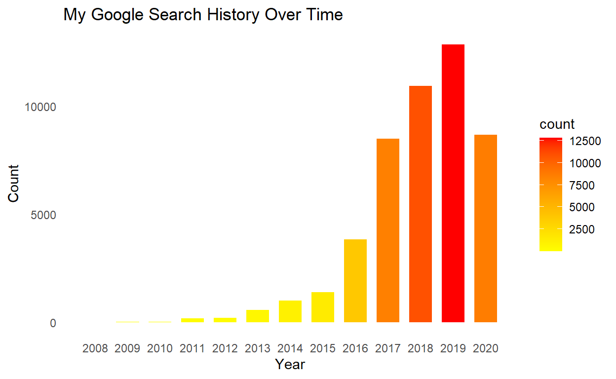
Starting with something simple, let’s look at overall searches by year. I would imagine that my search history would grow linearly as technology and cell phones becomes more and more relevant. I am also expecting a spike in 2020 due to COVID-19 and being home more.
## searches over time
searchedData %>%
ggplot(aes(year, fill = stat(count))) +
geom_bar(width = 0.7) +
scale_fill_gradient(low = "yellow", high = "red") +
labs(title = "My Google Search History Over Time",
x = "Year",
y = "Count"
) +
theme(panel.grid.major = element_blank(), panel.grid.minor = element_blank()) +
scale_x_continuous(breaks = c(2008:2020))
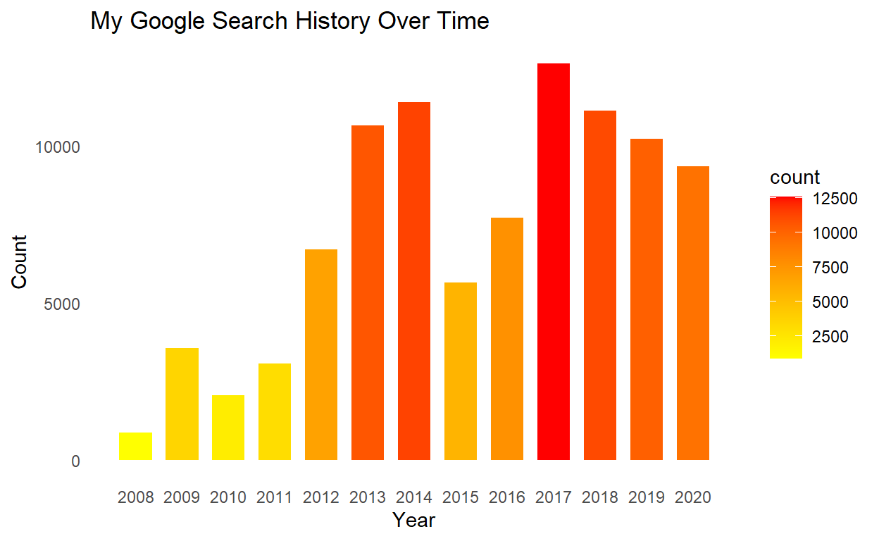
Well that is surprising. Turns out my search activity reached it’s peak in 2017 after a drop in searches after 2014 and has been steadily declining since the peak in 2017. I have a few hypotheses on why my search activity looks like this. Hopefully we’ll figure out if any of my ideas hold true once we dive further into the data.
## searches by month
searchedData %>%
filter(year > 2012 & year < 2021) %>%
group_by(year, month) %>%
summarise(searches = n()) %>%
hchart(type = "heatmap", hcaes(x = year, y = month, value = searches), name = "Searches") %>%
hc_title(text = "Search History Over Time") %>%
hc_xAxis(title = list(text="Year / Month")) %>%
hc_yAxis(title = FALSE, reversed = TRUE) %>%
hc_tooltip(borderColor = "black",
pointFormat = "{point.searches}") %>%
hc_colorAxis(minColor = "yellow",
maxColor = "red") %>%
hc_legend(align = "center", verticalAlign = "top", layout = "horizontal")
Here’s my first shot at an interactive heatmap chart from the {highcharter} package and I have already uncovered an anomaly in my search history using this visual! Something very interesting took place in September of 2017. I searched 1,919 times in September, the highest number of searches in a single month. The next closest month was April, 2014! Now before we look into this specific month, let’s look at a few other descriptive statistics on time of day and day of week search behavior.
## search by hour
searchedData %>%
ggplot(aes(hour, fill = stat(count))) +
scale_fill_gradient(low = "yellow", high = "red") +
geom_bar() +
labs(title = "Search History by Hour of Day",
x = "Hour",
y = "Count"
) +
theme(panel.grid.major = element_blank(), panel.grid.minor = element_blank()) +
scale_x_continuous(breaks = c(0:23))
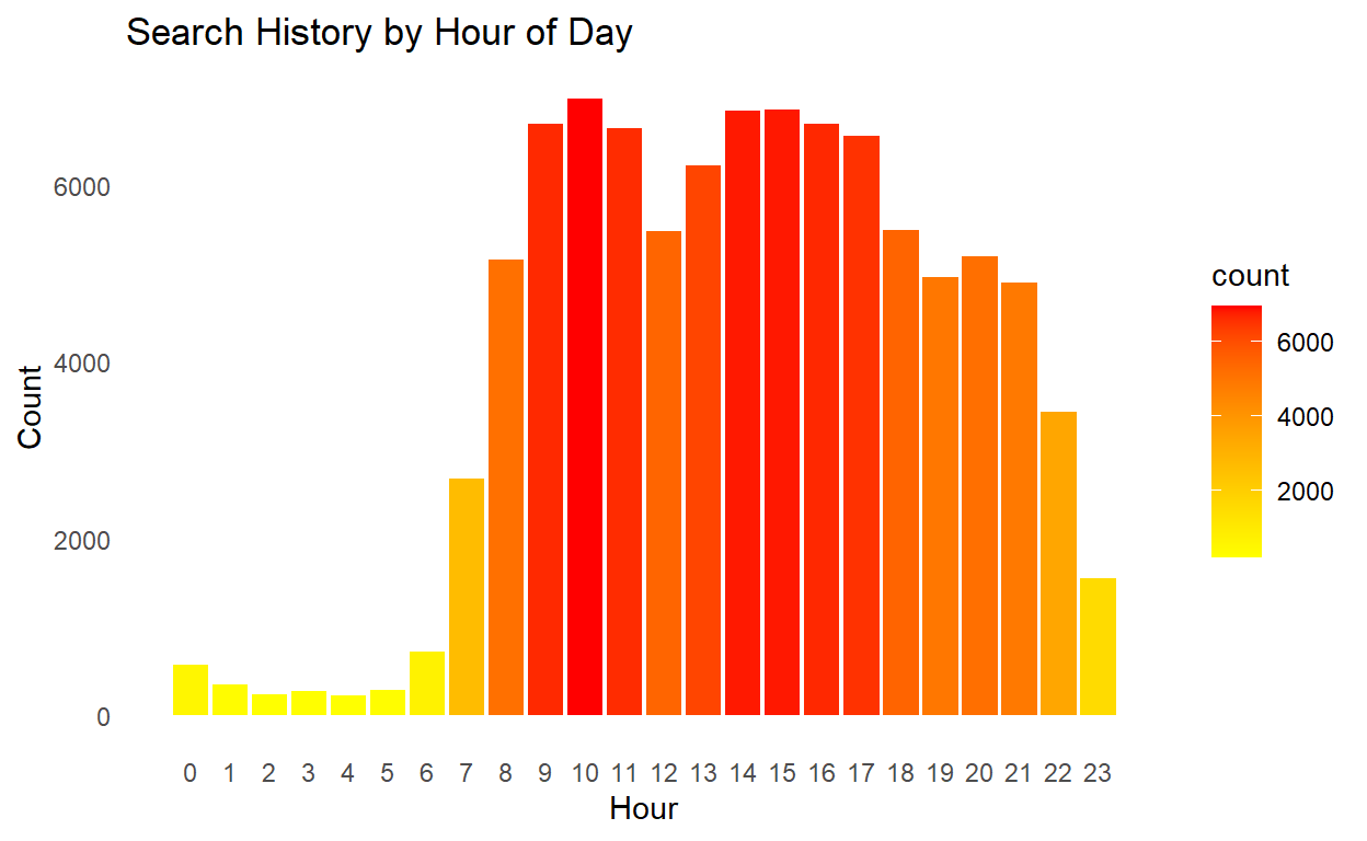
For anyone needing evidence of insomnia, this may be a good test! Turns out my search history is directly correlated with my sleep schedule, which probably happens to be a good thing for my health. Not too surprising, my search history lines up with a 9-5 schedule sprinkled with evening searching. Overall, my searching mainly peaks throughout the day and experiences a sharp decline during the late evening and early hours when I’m sleeping.
## search by day
searchedData %>%
ggplot(aes(day, fill = stat(count))) +
scale_fill_gradient(low = "yellow", high = "red") +
geom_bar() +
labs(title = "Search History by Day of Week",
x = "Day",
y = "Count"
) +
theme(panel.grid.major = element_blank(), panel.grid.minor = element_blank())
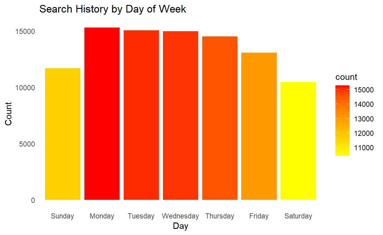
It also turns out my search history follows a normal work week, too. I search the most on Monday and by the time the weekend comes around, I’m searching far less and hopefully enjoying time outside or with friends and family.
searchedData %>%
group_by(day, hour) %>%
summarise(searches = n()) %>%
mutate(day = factor(day,
levels = c("Monday", "Tuesday", "Wednesday", "Thursday", "Friday", "Saturday", "Sunday"))) %>%
hchart(type = "heatmap", hcaes(x = hour, y = day, value = searches), name = "Searches") %>%
hc_title(text = "Search History Day/Time Heatmap") %>%
hc_xAxis(title = list(text="Hour")) %>%
hc_yAxis(title = FALSE, reversed = TRUE) %>%
hc_tooltip(borderColor = "black",
pointFormat = "Searches: {point.searches}") %>%
hc_colorAxis(minColor = "yellow",
maxColor = "red") %>%
hc_legend(align = "center", verticalAlign = "top", layout = "horizontal")
Tying these temporal analyses together, my search trends are fairly consistent by day and time. It does appear, though, as the week begins to wind down, my Google searching experiences a reduction in activity. Safe to say I may be partaking in a few early summer Friday’s at work! 🤣
Wordclouds
Alright let’s take a look at a few wordclouds next, starting with a cloud of my complete search tokens and then moving onto some more specific analysis based on the observations we made above. I will use the {tidytext} package to extract the words from all of my searches. {tidytext} is an incredibly powerful text mining package; I would suggest getting comfortable with it if you plan on doing similar analyses with text mining data such as twitter, transcripts or books.
## text mine google search phrases
textData <- searchedData %>%
select(date, search) %>%
mutate(search = tolower(search)) %>%
unnest_tokens("word", search) %>%
## count(word, sort = TRUE)
## ^ to see how rough the data is before text cleaining
anti_join(stop_words) %>%
filter(!(word %in% c("https", "http", "amp")))
textData <- textData[-grep("\\b\\d+\\b", textData$word),]
textData <- textData[-grep("(.*.)\\.com(.*.)\\S+\\s|[^[:alnum:]]", textData$word),]
textDT <- textData %>%
count(word, sort = TRUE)
## side by side wordclouds
par(mfrow=c(1,2))
## wordcloud for search terms
textCloud <- wordcloud(words = textDT$word, main = "Title",
freq = textDT$n,
min.freq = 1, max.words = 125,
random.order = FALSE, colors = brewer.pal(10, "Spectral"))

textDTSept <- textData %>%
filter(year(date) == 2017) %>%
filter(month(date) == 09) %>%
count(word, sort = TRUE)
textCloud <- wordcloud(words = textDT$word, main = "Title",
freq = textDT$n,
min.freq = 1, max.words = 125,
random.order = FALSE, colors = brewer.pal(10, "Spectral"))
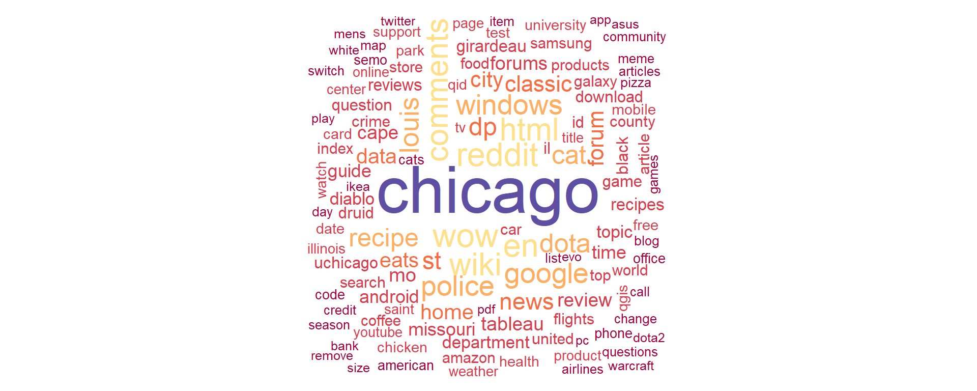
So if you haven’t figured it out yet, wordclouds are simple to make in R (after the data cleaning with {tidytext} ) and they are really useful in text analysis, making key terms ‘pop’ while also allowing the reader to make connections between words. Take the example of the left wordcloud of all my Google searches since 2012. I live in Chicago so it’s almost expected that Chicago is my most searched term, mainly to keep my Google searches local. Next up, I am a huge Reddit user and it’s clear from my wordcloud I search Reddit a lot. Aside from scrolling and entertainment, I also use Reddit for more practical things like advice, suggestions, coding, and unbiased reviews. Before I purchase any product or item, I will usually search the product on Google, followed by “Reddit comments” to read reviews and thoughts from other people around the world. A few other interested observations: Tableau is my most searched analysis tool followed by QGIS; I think R didn’t make it in the wordcloud because its just a letter (rmarkdown did make it on the wordcloud on the bottom right). Finally, lots of cooking terms in the wordcloud including recipe, knife, eats (serious eats), pizza, cheese, etc. I am an avid home chef so that’s no surprise to me (or my fiance!).
Now, ironically, the wordcloud on the right, specific to the September 2017 spike we found, does not really offer any insights into why there were so many searches. That’s unfortunate but I have a few other ideas to try and pull out some more insights into this particular time period.
## plot search terms over time, by term
ggplotly(
textData %>%
mutate(date = year(date)) %>%
mutate(date = str_sub(date)) %>%
group_by(date, word) %>%
summarise(count = n()) %>%
slice_max(order_by = count,
n = 10,
with_ties = TRUE) %>%
ggplot(aes(x = date, y = count)) +
geom_text(aes(size = count, label = paste(word), text = paste(
"In", date, "I searched", word, count, "times"))) +
labs(
title = "Search Words By Year",
x = "Year",
y = "Search Count"
) +
theme(panel.grid.major = element_blank(), panel.grid.minor = element_blank())
, tooltip = "text"
)
Aha! We’re finally getting somewhere on my 2017 Google search spike. Chicago was by far my most searched term in 2017, nearly double any other term I’ve ever searched on Google (which also turn out to be ‘Chicago’, ironically). This plot also shows my progression (and linear growth) of search terms over time - definitely a trip down memory lane! Back in 2008, my top search was for ‘blackberry’. In 2009, ‘windows’ was my top search because Windows 7 was released that year and I distinctly remember participating in the Windows beta/developer versions which, by the way, was a terrible idea to test out an unstable version of Windows while simultaneously attending college. Between 2010 and 2016, my search history was noisy and difficult to interpret until I decided to resign as a police officer, move to Chicago, and attend grad school at the University of Chicago around the summer of 2016 when Chicago began to leap into my top search term. After 2016, my search history clears up to the themes we identified in the wordclouds. This plot was so helpful in digging into my search history, I wonder what a plot of key search terms specific to 2017 would look like …
## plot search terms for 2017
ggplotly(
textData %>%
filter(year(date) == 2017) %>%
group_by(date, word) %>%
mutate(date = factor(months(date))) %>%
summarise(count = n()) %>%
slice_max(order_by = count,
n = 10,
with_ties = TRUE) %>%
ggplot(aes(x = date, y = count)) +
geom_text(aes(size = count, label = paste(word), text = paste(
"In", date, "I searched", word, count, "times"))) +
labs(
title = "Search Words by Month, 2017",
x = NULL,
y = "Search Count"
) +
theme(panel.grid.major = element_blank(), panel.grid.minor = element_blank())
, tooltip = "text"
)

Wonder no further! Chicago was consistently one of my most searched terms in 2017, clearing up the reason why it was the top search for the year and why 2017 was such an outlier. Thinking back, the year 2017 brought a lot of changes and challenges to my life. I completed my graduate thesis and graduated from UChicago with my second master’s, began a long and arduous job hunt, and started a new job at the UChicago Crime Lab. With that in mind, I’m not too surprised this year had such a high search volume.
Important mental note here - with my start at a new job, my Google activity was essentially split between my personal Google account and my work Google account. Thus, the drop off in activity and starting in 2017 - though I’m not sure why it has not leveled off yet.
Google Maps
## Not ran - time intensive process to load, manipulate and write 2.2gb json file of location history.
## I suggest running this once with the cleaning steps and writing to another file, as I have done below
# # load google map location data
# loc_hist_takeout <- fromJSON("~/GitHub/kjmagnan1s.github.io/blog_data/google_takeout/Takeout/My Activity/Maps/Location History.json", flatten = TRUE)
# locations <- loc_hist_takeout$locations
# rm(loc_hist_takeout) ## free up memory from large json files
#
# ## clean json data
# locations <- locations %>%
# ## convert the time column from milliseconds
# mutate(time = as.POSIXct(as.numeric(timestampMs)/1000, origin = "1970-01-01")) %>%
# ## clean/arrange date columns
# mutate(day = day(time)) %>%
# mutate(day = ordered(day, levels = c("Monday", "Tuesday", "Wednesday", "Thursday", "Friday", "Saturday", "Sunday"))) %>%
# ## conver lat/long from E7 to coordinates
# mutate(lat = latitudeE7/1e7) %>%
# mutate(long = longitudeE7/1e7) %>%
# ## remove unnecessary columns
# select(time, lat, long)
#
# ## write to csv for later use, maybe a Tableau dashboard
# write.csv(locations, file = "~/GitHub/kjmagnan1s.github.io/blog_data/google_takeout_location_data.csv")
## load pre-cleaned location history data
locations <- read.csv("~/GitHub/blog_website_2.0/blog_data/google_takeout_location_data.csv")
glimpse(locations)
Rows: 1,760,771
Columns: 4
$ X <int> 1, 2, 3, 4, 5, 6, 7, 8, 9, 10, 11, 12, 13, 14, 15, 16, 17, 18, 19~
$ time <chr> "2012-10-26 11:23:55", "2012-10-26 11:24:57", "2012-10-26 11:25:5~
$ lat <dbl> 37.30934, 37.30861, 37.30931, 37.30861, 37.30931, 37.30861, 37.30~
$ long <dbl> -89.53574, -89.53561, -89.53569, -89.53561, -89.53562, -89.53561,~# ## load map searches
mymapfile <- read_html("~/GitHub/blog_website_2.0/blog_data/google_takeout/Takeout/My Activity/Maps/MyActivity.html", encoding = "UTF-8")
## re-running the cleaning code on the google map searches
## Scraping map date and time
dateMapped <- mymapfile %>%
html_nodes(xpath = '//div[@class="mdl-grid"]/div/div') %>%
str_extract(pattern = "(?<=<br>)(.*)(?<=PM|AM)") %>%
mdy_hms()
## Scraping map text
textMapped <- mymapfile %>%
html_nodes(xpath = '//div[@class="mdl-grid"]/div/div') %>%
str_extract(pattern = '(?<=<a)(.*)(?=</a>)') %>%
str_extract(pattern = '(?<=\">)(.*)')
## Scraping map type
typeMapped <- mymapfile %>%
html_nodes(xpath = '//div[@class="mdl-grid"]/div/div') %>%
str_extract(pattern = '(?<=mdl-typography--body-1\">)(.*)(?=<a)') %>%
str_extract(pattern = '(\\w+)(?=\\s)')
mappedData <- tibble(timestamp = dateMapped,
date = as_date(dateMapped),
day = weekdays(dateMapped),
month = month(dateMapped, label = TRUE),
year = year(dateMapped),
hour = hour(dateMapped),
search = textMapped,
type = typeMapped)
mappedData <- mappedData %>%
mutate(day = factor(day, levels = c("Sunday", "Monday", "Tuesday", "Wednesday", "Thursday", "Friday", "Saturday"))) %>%
#na.omit %>%
clean_names()
## from janitor
glimpse(mappedData)
Rows: 58,226
Columns: 8
$ timestamp <dttm> 2020-11-12 16:28:10, 2020-11-12 16:28:03, 2020-11-12 16:27:~
$ date <date> 2020-11-12, 2020-11-12, 2020-11-12, 2020-11-12, 2020-11-12,~
$ day <fct> Thursday, Thursday, Thursday, Thursday, Thursday, Thursday, ~
$ month <ord> Nov, Nov, Nov, Nov, Nov, Nov, Nov, Nov, Nov, Nov, Nov, Nov, ~
$ year <dbl> 2020, 2020, 2020, 2020, 2020, 2020, 2020, 2020, 2020, 2020, ~
$ hour <int> 16, 16, 16, 10, 10, 10, 9, 9, 17, 17, 17, 17, 17, 17, 15, 15~
$ search <chr> NA, "Viewed area in Google Maps", "Lonesome Rose", NA, "Beve~
$ type <chr> NA, NA, NA, NA, NA, NA, NA, NA, NA, NA, NA, NA, NA, NA, "Sea~If there is any other tech service I use as much as Google Search, it would be Google Maps. I thought it would be fun to compare my Google Maps activity now that I have analyzed my search activity. I’m expecting much less Google Map activity throughout the week and significant increases in activity at night and on the weekends. As we saw before, my Google activity could very easily surprise me, although I expect less surprises with my map data as I assume most of my activity is from my phone and during personal time. I have also exported my Google location history data and I’m super excited to play around with mapping that data. I have a lot of experience in GIS and spatial analysis with Tableau, QGIS, ArcGIS, and GeoDa but not very much in R so I’m looking forward to experimenting with that next.
## map searches over time
mappedData %>%
ggplot(aes(year, fill = stat(count))) +
geom_bar(width = 0.7) +
scale_fill_gradient(low = "yellow", high = "red") +
labs(title = "My Google Search History Over Time",
x = "Year",
y = "Count"
) +
theme(panel.grid.major = element_blank(), panel.grid.minor = element_blank()) +
scale_x_continuous(breaks = c(2008:2020))
See now this is the kind of chart I expected for my Google Searches! What an interesting ramp up of activity over the years, especially between 2016 and 2017 - again around the time I moved to Chicago and started exploring the city. And we finally have a good indication of how COVID has impacted my search behaviors. I have been socially distant and at home for most of the year. That really shows with the dramatic drop in Google map search activity in 2020. This was the full list of activity, including directions, viewed areas (which I learned Google tracks), and some ‘NA’ values. Let’s remove those, add some more granularity, and see if that changes this plot.
## map views/searches by year
ggplotly(
mappedData %>%
mutate(type = (ifelse(grepl("Viewed area", search), "Viewed", "Searched"))) %>%
## notate rows which are Google Map views or searches in the app
na.omit() %>%
group_by(year, type) %>%
summarise(count = n()) %>%
ggplot(aes(year, count, fill = type, text = paste(
"Year:", year,
"<br>Count:", count))) +
geom_col(width = 0.7) +
labs(title = "My Google Search History Over Time by Type",
x = "Year",
y = "Count"
) +
scale_fill_manual(breaks = c("Searched", "Viewed"),
values = c("red", "gold")) +
theme(panel.grid.major = element_blank(), panel.grid.minor = element_blank()) +
scale_x_continuous(breaks = c(2008:2020)
), tooltip = "text"
)
Fascinating! This data appears to be a symptom of how Google has recorded map activity overtime, but it would seem that my map viewing on Google Maps (navigating through Google Maps via the map and not searching addresses or locations) has increased dramatically over time while my Google Map searches (searching addresses or specific locations) have remained relatively stable since 2016. The dramatic increase in viewed map activity in 2017 is so dramatic that I think Google did actually change the way they record activity around this time. However, there is an argument to be made that my viewed map activity increased this much due to increased accessibility, speed of mobile networks, and moving to a new city. Nonetheless, I’ll take these insights; my viewed map activity has increased nearly 3x since 2017.
Let’s take a loot at a few more heatmaps, followed by some real maps and we’ll call this a day!
## map activity over time, heatmap
mappedData %>%
## filter out data before 2011, was incomplete
filter(year > 2011) %>%
na.omit() %>%
group_by(year, month) %>%
summarise(count = n()) %>%
hchart(type = "heatmap", hcaes(x = year, y = month, value = count), name = "Searches") %>%
hc_title(text = "Map History Year/Month Heatmap") %>%
hc_xAxis(title = list(text="Year")) %>%
hc_yAxis(title = FALSE, reversed = TRUE) %>%
hc_tooltip(borderColor = "black",
pointFormat = "In {point.month} of {point.year}, I searched {point.count} times") %>%
hc_colorAxis(minColor = "yellow",
maxColor = "red") %>%
hc_legend(align = "center", verticalAlign = "top", layout = "horizontal")
What I really like about these heatmaps are that they show a clear progression through time but also provide a lot of granularity compared with a simple bar chart and there is not a need to do any math in your head to visualize changes over time. For example, there is a clear growth of Google Map searches through 2018, and it looks like it really picks up in 2016. However, we can see a substantial and isolated spike in activity in February 2014, which did not happen again until my activity started to increase more in 2016. We also see two months in 2018 which impacted the years overall activity - August and December. These months were both over 200 searches and no other month has peaked over 200 in all of my activity. The COVID impact is also extremely apparent in the 2020 column. It closely resembles my activity as far back as 2014/15.
## map activity over time, heatmap
mappedData %>%
na.omit() %>%
group_by(day, hour) %>%
summarise(count = n()) %>%
hchart(type = "heatmap", hcaes(x = hour, y = day, value = count), name = "Searches") %>%
hc_title(text = "Map History Day/Time Heatmap") %>%
hc_xAxis(title = list(text="Hour")) %>%
hc_yAxis(title = FALSE, reversed = TRUE) %>%
hc_tooltip(borderColor = "black",
pointFormat = "At {point.hour}:00 hours, I searched {point.count} times") %>%
hc_colorAxis(minColor = "yellow",
maxColor = "red") %>%
hc_legend(align = "center", verticalAlign = "top", layout = "horizontal")
Here’s another sanity check for insomnia… Turns out I don’t use Google Maps very much after around midnight until 7 am which is a good sign! My activity throughout the day is spread out and is not too surprising. Quick note, we see my summer Friday activity creeping up again at 11:00 hours where I’m most likely looking for a place to go grab a drink and some food with coworkers.
## map my location history data for Chicago
register_google(Sys.getenv("my_api"), ## Your API key goes here!
account_type = "standard")
chi_town <- get_map("Chicago, Illinois", zoom = 11)
ggmap(chi_town) +
stat_density2d(data = locations, aes(x = long, y = lat, fill = ..level.., alpha = ..level..),
size = 1, bins = 1000,
geom = "polygon") +
theme(axis.text.x = element_blank(),
axis.ticks = element_blank(),
axis.title = element_blank(),
axis.text.y = element_blank(),
)
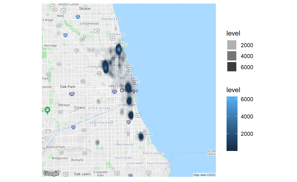
Finally, some mapping! This map is terrific and terrifying at the same time. It is 100% accurate in that it shows where I spend most of my time in Chicago, which is the terrifying part because Google knows exactly where I live, work, and went to school (which honestly should not be that surprising). The two intense clusters north of downtown, in Uptown and Bucktown, show where I’ve lived in Chicago. The most south cluster represents my time at UChicago and the middle three clusters represent the locations I mostly work out of. I actually found it really interesting to focus on the opaque, light gray clustered activity which closely follows the main roads I take to go grocery shopping or take the ‘L’ to downtown.