I’m back, Jeans! For those who missed Part I of this two-part YMH analysis, I followed along with Eric Ekholm’s blog post to pull YouTube speech-to-text captions for a playlist of YMH videos. If you missed the warning, this is NSFW content so tread lightly all you cool cats and kittens.
Now that we have the YouTube text data, it’s time to dive in and see what we can learn about our pals Tom and Christine. Similar to Part 1’s blog post, I am going to follow along with Eric’s second YMH blog post where he analyzed this data and find opportunities to learn from him as well as unpack the data in other ways.
Before we get off on this analysis, there are a few important observations of the text data I should mention:
The episode transcripts are automatically created by Youtube’s speech-to-text model. It usually performs very well, but it does make some mistakes & obviously has trouble with proper nouns (e.g. TikTok).
The speakers of each phrase are not tagged or timestamped. That is, there are no indications whether Tom, Christina, or someone else are speaking any given line.
This should be fairly obvious at this point but I’m only looking at the episodes available on Youtube. The most recent episode included is episode 572 with Chris Distefano, aka Chrissy Drip Drop, aka Chrissy one-and-done, aka Chrissy vodka soda.
Alright we’ve feathered it enough, let’s get started with some data cleaning and manipulation.
Setup and data work
library(tidyverse)
library(lubridate)
library(tm)         ## text mining
library(tidytext)   ## text mining
library(tidylo)     ## improved weights to lists, like top_n
library(igraph)     ## edge sequencing
library(ggraph)     ## ggplot2
library(vroom)      ## improved csv reading & in line piping
library(reactable)  ## interactive tables
library(plotly)     ## interactive plots!!
library(wordcloud)


ymh <- vroom("~/GitHub/blog_website_2.0/blog_data/ymh_data.csv")

ymh_single_row <- ymh %>%
  group_by(title, ep_no) %>%
  summarise(text = str_c(text, collapse = " ") %>%
              str_to_lower()) %>%
  ungroup()
Descriptives
Episode length
We have a total of 175 observations, or episodes, worth of data to investigate, ranging from episode 345 to 572. Let’s take a look at some descriptives about YMH episodes.
ep_length <- ymh %>%
  group_by(ep_no) %>%
  summarise(minutes = (max(start) + max(duration))/60) %>%
  ungroup()

ggplotly(ep_length %>%
  ggplot(aes(x = ep_no, y = minutes)) +
  geom_point(color = "black") +
  geom_line(color = "black") +
  labs(
    title = "YMH Episode Length",
    x = "Episode Number",
    y = "Length (mins)"
  )
  )
It looks like we have an outlier episode. If you hover over that point on the plot with your mouse/cursor (yes, these plots are interactive!), you will see there is a break between in subtitles generated by YouTube between approx. episode 330 and 394. Let’s go ahead and remove all episodes below 394 moving forward and try this again
ymh <- ymh %>% filter(ep_no > 393)

ep_length <- ymh %>%
  group_by(ep_no) %>%
  summarise(minutes = (max(start) + max(duration))/60) %>%
  ungroup()

ggplotly(
  ep_length %>%
  ggplot(aes(x = ep_no, y = minutes)) +
  geom_point(color = "black") +
  geom_line(color = "black") +
  labs(
    title = "YMH Episode Length",
    x = "Episode Number",
    y = "Length (mins)"
  )
  )
That’s much better!
Looking at the second plot, it’s clear that around episode 450, the length of episodes began to increase to upwards of 250 minutes long (4 hours!) before plateauing at around 150 minutes. It’s interesting to see such wide variability in episode length, instead of more stepped/staggered changes. There are a lot of lows and highs among episode lengths, symptomatic of a person on Meth as Dr Drew would point out. With this much variability, let’s fit a smooth line to the plot to help identify more trends.
ggplotly(
  ep_length %>%
  ggplot(aes(x = ep_no, y = minutes)) +
  geom_point(color = "black") +
  geom_line(color = "black") +
  geom_smooth(method = "loess", formula = "y ~ x", color = "blue") +
  labs(
    title = "YMH Episode Length, Second Attempt",
    x = "Episode Number",
    y = "Length (mins)"
  )
  )
Ah, that looks better. So it looks like episode length hit it’s peak around episode 480 and smooths out at approximately ~150 minutes.
Guests
Guests, usually fellow comedians, are a huge part of the show. Let’s look into the official guests on the show. I say official because I am reliant upon the title to inform me who was a guest on the show. Regular characters like Tom’s parents, Dr Drew, and Josh Potter won’t show up in this figure.
ymh %>%
  distinct(ep_no, .keep_all = TRUE) %>%
  mutate(guests = str_replace_all(guests, "\\&", ",")) %>%
  separate_rows(guests, sep = ",") %>%
  mutate(guests, str_trim(guests)) %>%
  filter(!is.na(guests)) %>%
  count(guests, name = "num_appearances", sort = TRUE) %>%
  filter(num_appearances > 1) %>%
  reactable()
Alright so not a big surprise to anyone that Tom’s best friend, Bert Kreischer, was the top guest here. I’m glad to see Nikki Glaser as number 3 on the list, for one reason because she is the only repeat female guest but she is also savagely hilarious. Overall, it’s pretty clear YMH does not have a lot of repeat guests (at least in in the most recent ~200 shows). You’ll notice I removed any guest who did not have more than 1 appearance to make the list more manageable.
Text Analysis
Word Usage
Moving past some of the descriptive data, lets get into the text analysis portion of this project - the result of all that YouTube API calling in Part I. I’ll be taking a lot cues from Eric’s blog post for this part since this will be my first time doing any serious textual analysis in R.
Just like in the limitations of guest count based on title, if you look at the YouTube text-to-speech data, it is not structured to show who is speaking when it records text. No matter, as you’ll see there is a lot of rich text and data in here to dig through.
The first step is to remove many of the common words in the English language like “the”, “at”, “I’m”, etc.
ymh_words <- ymh_single_row %>%
  filter(ep_no > 393)%>%
  unnest_tokens(word, text)
## creates a token for each word in the single row text
## column we collapsed in the beginning of the post.

ymh_words <- ymh_words %>%
  anti_join(stop_words) %>%
  ## anti_join = ! in that it returns the opposite of what we want.
  ## In this case, it returns all words that do not match with the stop_words
  ## function containing the entire lexicon of English common words like "the"
filter(!(word %in% c("yeah", "gonna", "uh", "hey", "cuz", "um", "lot"))) %>%
  ## filtering out additional common YMH specific words
filter(!(is.na(word)))

ggplotly(
  ymh_words %>%
  count(word) %>%
  slice_max(order_by = n, n = 20) %>%
  ## select the top 20 rows and order them
  ggplot(aes(x = n, y = fct_reorder(word, n))) +
  geom_col(fill = "red") +
  labs(
    title = "Most Used YMH Words",
    y = NULL,
    x = "Count"
  )
  )
You have got to be __ ’ing kidding me. Turns out that somehow Eric was able to download the raw/uncensored YouTube captions back in May and I’m stuck here with this __ . When I noticed I wasn’t finding any curse words, I went back and watched a few YMH clips and noticed that every time they cursed, the YouTube captions transcribed __ on the video closed captions. And, as you can see from the chart, they’ve essentially aggregated all curse words into one huge cluster- __ . Let’s see if we can still work around this and even use it to our advantage.
Aside from YouTube censoring of our analysis, we have a few other notable mentions in the top 20 words used. “People” is clearing the most used word, but we also see “guy”, “cool”, “crazy”, and “music”. YMH does have some incredibly talented fans with their music submissions to close out the episode, Hendawg for example, so “music” makes a lot of sense.
Wordcloud
The bar chart was a little boring and is limited to the top 20 words. Let’s look at a more nuanced text analysis visualization: Wordclouds. Turns out the {wordcloud} package makes these things trivial to recreate with a bit of formatting.
ymh_wc <- ymh_words %>%
  count(word) %>% filter(!grepl("[[a-z]]+", word))

ymh_wc$word <- removePunctuation(ymh_wc$word)
## Our curse word symbol "__" won't look right in the wordcloud so I opted to remove it

ymh_wc_p <- wordcloud(words = ymh_wc$word, freq = ymh_wc$n, min.freq = 1,
            max.words = 300, random.order = FALSE,
            colors = brewer.pal(8, "Set1"))
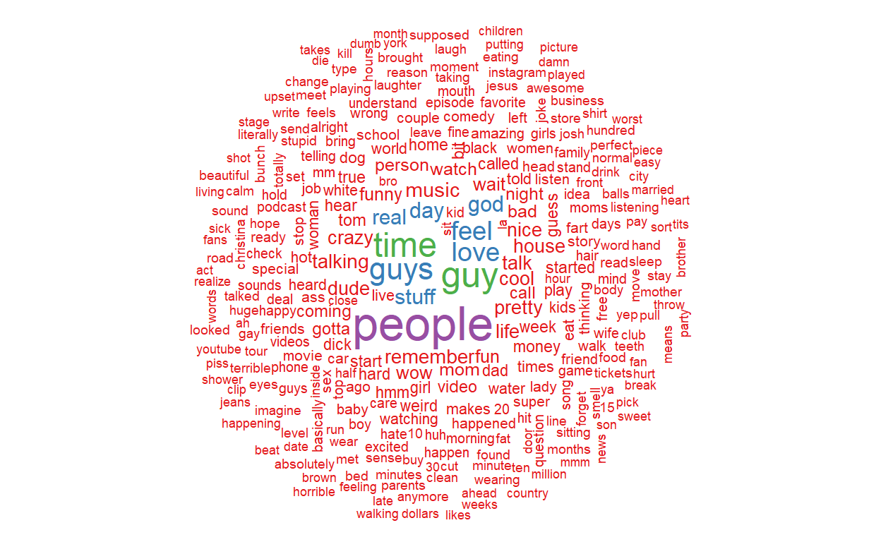
Even though we had to remove __ from the wordcloud (I could have replaced it with “curses” but we would just have a huge “curses” in the middle which isn’t very insightful), there are still some interesting words in here. One thing is for sure, I could increase the max.words() even higher than 300 and the takeaway here woudls till be that YMH has a wide vocabulary - not surprising for a podcast with almost 600 episodes.
Potty Mouths
Given that YouTube seems to have provided us with a curse word catch-all token, let’s see if we can use this to our advantage. In Eric’s blog post, he looked into number of “fuckings” per minute by episode. We can do the same thing here for __ .
## quick note here: while writing this plot I kept getting "Error in annotate: unused arguments"
## because both the {tlm} and {ggplot2} packages have annotate functions. To resolve that, I simply
## force-called the ggplot2 function and it worked fine!

ggplotly(
  ymh_words %>%
  filter(word == "__") %>%
  count(ep_no, word) %>%
  left_join(ep_length, by = "ep_no") %>%
  mutate(cpm = n/minutes) %>%
  ggplot(aes(x = ep_no, y = cpm)) +
  geom_text(aes(size = cpm), label = "curses",
            show.legend = FALSE, color = "black") +
    ggplot2::annotate("text", x = 535, y = 3.39,
                      label = "- Ep. 494 w/ Joey 'Coco' Diaz",
                      hjust = 0, size = 3.5) +
    ggplot2::annotate("curve", x = 494, xend = 500, y = 3.2,
                      yend = 3, curvature = .4) +
  labs(
    title = "__'s per minute per YMH episode",
    x = "Episode number",
    y = "__'s per minute"
  )
  )
Woah so here’s a shocker! Episode 494 with Joey Diaz blows away the other episodes! Episode 494 had nearly 3.5 curse words per minute, 50% more than the next closest episode (ep. 451 w/ Chris D’Elia) for a total of 460 curse words in just 2 hours. Funny enough, episode 516 with Donnell Rawlings and Grant Cardone had the last number of curses, just 26 (looks like a little spec just after 500 on the x-axis).
Catch Phrase Traceback
YMH is known for their catch phrases. Whether its “try it out”, “feathering in”, or “water champ”, the true mommies have a lot of inside jokes. Let’s see if we can traceback these jokes to when they first made appearances on the show. (Note: since we do not have a full collection of YMH episodes and the earlier episodes were audio only, we’ll only be able to traceback more recent phrases. I doubt we’ll be able to find the origin of “Jeans” or “Mommies” in here).
ggplotly(
  ymh_words %>%
  filter(word == "julia") %>%
  count(ep_no, word) %>%
  left_join(x = tibble(ep_no = unique(ep_length$ep_no), word = "julia"),
            y = ., by = c("ep_no", "word")) %>%
  mutate(n = replace_na(n, 0)) %>%
  ggplot(aes(x = ep_no, y = n)) +
  geom_line(color = "black", size = 1.25) +
    labs(
    title = "Good Morning, Julia!",
    subtitle = "Counts of the word Julia per episode",
    x = "Episode Number",
    y = "Count")
  ) %>%
  layout(title = list(text = paste0("Good Morning, Julia!",
                                    "<br>",
                                    "<sup>",
                                    "Counts of the word Julia per episode",
                                    "</sup>")))
The word Julia clearly saw a limited run on YMH. It peaked, dramatically, on episode 478 and was first mentioned on episode 432. Julia was last used during episode 556 so it hasn’t seen any action, so to speak, for about 20 episodes. That spike in episode 478 is interesting, though! Checking Eric’s blog post, it looks like that episode had Tom and Christina actually interview Julia. That makes a lot of sense in how the show runs, they probably locked down the interview a few episodes prior and hyped it up by playing the video a lot, which would explain the increase on episode 468. Afterwards, the word essentially lost popularity after the hype died out in the following episodes.
We aren’t stop here. There are a plenty of other words or phrases to try to traceback with this data. Eric, in his blog post, wrote a neat little function to extract a bunch of words/phrases and create a faceted graph. Let’s try that out. (As a personal note, I did not write this function, Eric did. I put in some time and effort to understand and explain it in the code chunk+ below but all credit for this function belongs to Eric.)
## create the function phrase
## for vector "nwords", if the string count is 1 = word, else if it is not = 1 then = "nram"
## (essentially a sequence of words, later identified as a phrase)
## for "ngrams" split the ymh_single_row table into tokens, "n = nwords" for the phrases, else for the "words"
## subset data in tpm which does not equal phrase function (i.e. does not equal the 'phrases' 'vector)
## create the phrase_list using the map() function and the i_phrase function based on the phrases vector

i_phrase <- function(phrase) {
  nwords <- str_count(phrase, " ") + 1

  token <- if (nwords == 1) {
    "words"
  } else {
     "ngrams"
  }

  tmp <- if (token == "ngrams") {
    ymh_single_row %>%
      unnest_tokens(output = words, input = text, token = token, n = nwords)
  } else {
    ymh_single_row %>%
      unnest_tokens(output = words, input = text, token = token)
  }

  tmp %>%
    filter(words == phrase)
}

phrases <- c("julia", "feathering it", "tick tock", "let me eat", "hitler",
             "ride or die", "sleep for three days", "face fart",
             "new relationship energy", "cool guy", "milligram tom", "badly")

ymh_phrase_list <- map(phrases, i_phrase)

phrase_grid <- expand_grid(unique(ep_length$ep_no), phrases) %>%
  rename(ep_no = 1)

ymh_phrase_df <- ymh_phrase_list %>%
  bind_rows() %>%
  count(ep_no, words) %>%
  left_join(x = phrase_grid, y = ., by = c("ep_no", "phrases" = "words")) %>%
  mutate(n = replace_na(n, 0))

ggplotly(
  ymh_phrase_df %>%
  mutate(phrases = str_to_title(phrases)) %>%
  ggplot(aes(x = ep_no, y = n)) +
  geom_line(color = "black") +
  facet_wrap(~phrases, scales = "free_y") +
  labs(
    y = "",
    x = "",
    title = "Now There's a Cool Guy!"
    )
)
Lot’s to unpack in here! First, I’ll point out that the y-axis is different for each plot. Synchronizing across all the y-axes would make it so some phrase counts would disappear entirely. Some interesting things I pulled out of this grid: “Cool Guy” spiked in usage over the past 175 episode during episode 570 with Ian Bagg. I’m guessing Christine had a particularly long ‘dark tock’ session. We also see some of Tom’s grammar in here, he consistently uses ‘badly’ throughout the playlist and particularly enjoyed using it word during episode 568. “Face fart”, one of my favorite phrases, is really dying out, with only 2 utterances lately. None of these words/phrases really compare with the ‘tick tock’ trend coming from the Christine corner. The tocks hit their peak during episode 511 with Ryan Sickler and Steven Randolph and seem consistent usage since.
That’s going to wrap it up for me and this analysis! This two-part blog post was a blast to work on! Not only did it refresh a lot of my {r} skills but I leanred a lot of new libraries and functions and, most importantly, it got me excited to keep blogging and working on projects!
Hope everyone learned something from this. Keep em High and Tight, Jeans!