Background
The idea of a Tableau interactive resume was not a new concept to me; I first published my version of it back in June of 2019. At that time, I was still learning a lot about Tableau concepts, visualization best practices, and was certainly still ‘trapped’ within a rigid framework of how to build a dashboard. As I reflected on a new version of my interactive resume in 2021, I appreciated my mindset back in 2019 while, at the same time, identifying numerous areas for improvement and opportunities to incorporate more advanced Tableau techniques I have cultivated over the years and following the work of others in the #DataFam Tableau Public community.
I hope that after reading this blog, you will feel empowered and motivated to explore and develop your interactive resume and share it with the world!
Planning New Dashboard
The first place to start when considering how to build and visualize your resume is on Tableau Public. I am a huge advocate for not reinventing the wheel and, instead, leveraging and building off of the incredible wealth of examples built by the Tableau community (with proper inspiration/credit given, of course!). With that in mind, starting with a review of Tableau’s Interactive Resume Gallery here is the best recommendation I can give for Tableau experts and newcomers, alike.
From there, I also found Google searches for ‘interactive resume’ or ‘visual resume’ helpful ways to explore other resume configurations, opportunities for interactivity, and visual inspiration. These searches usually resulted in more graphic design and photography content - a helpful nuance to the more data-focused inspiration from the Tableau community.
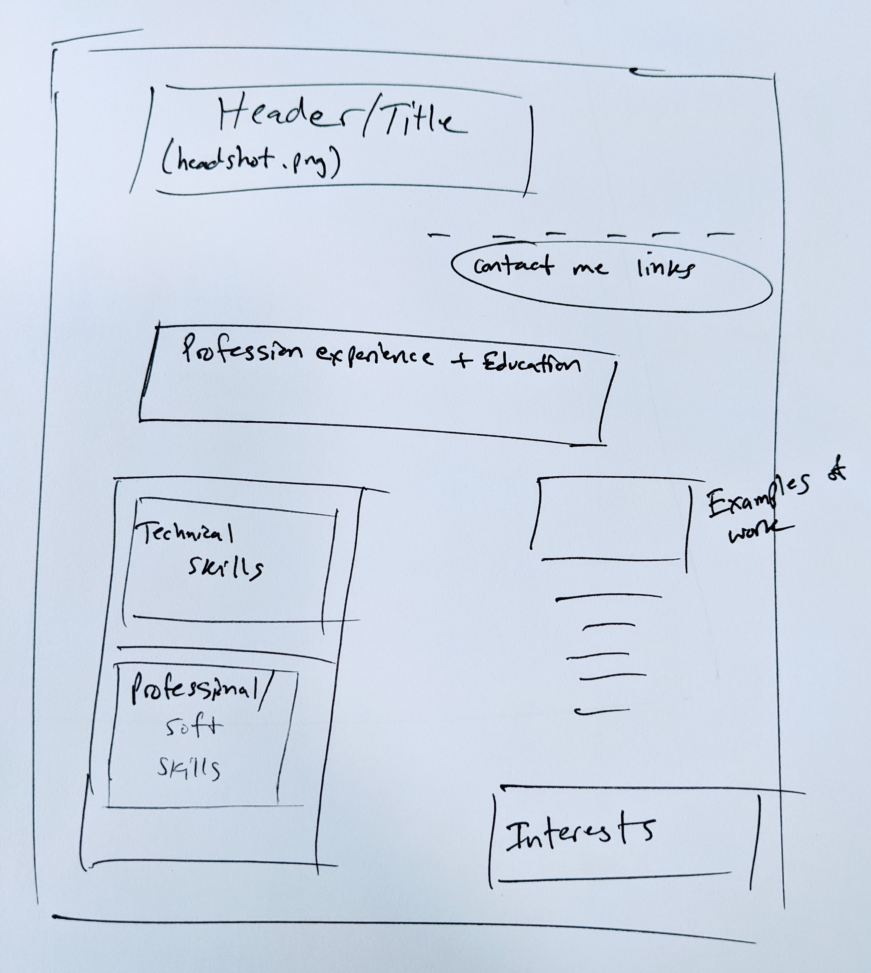
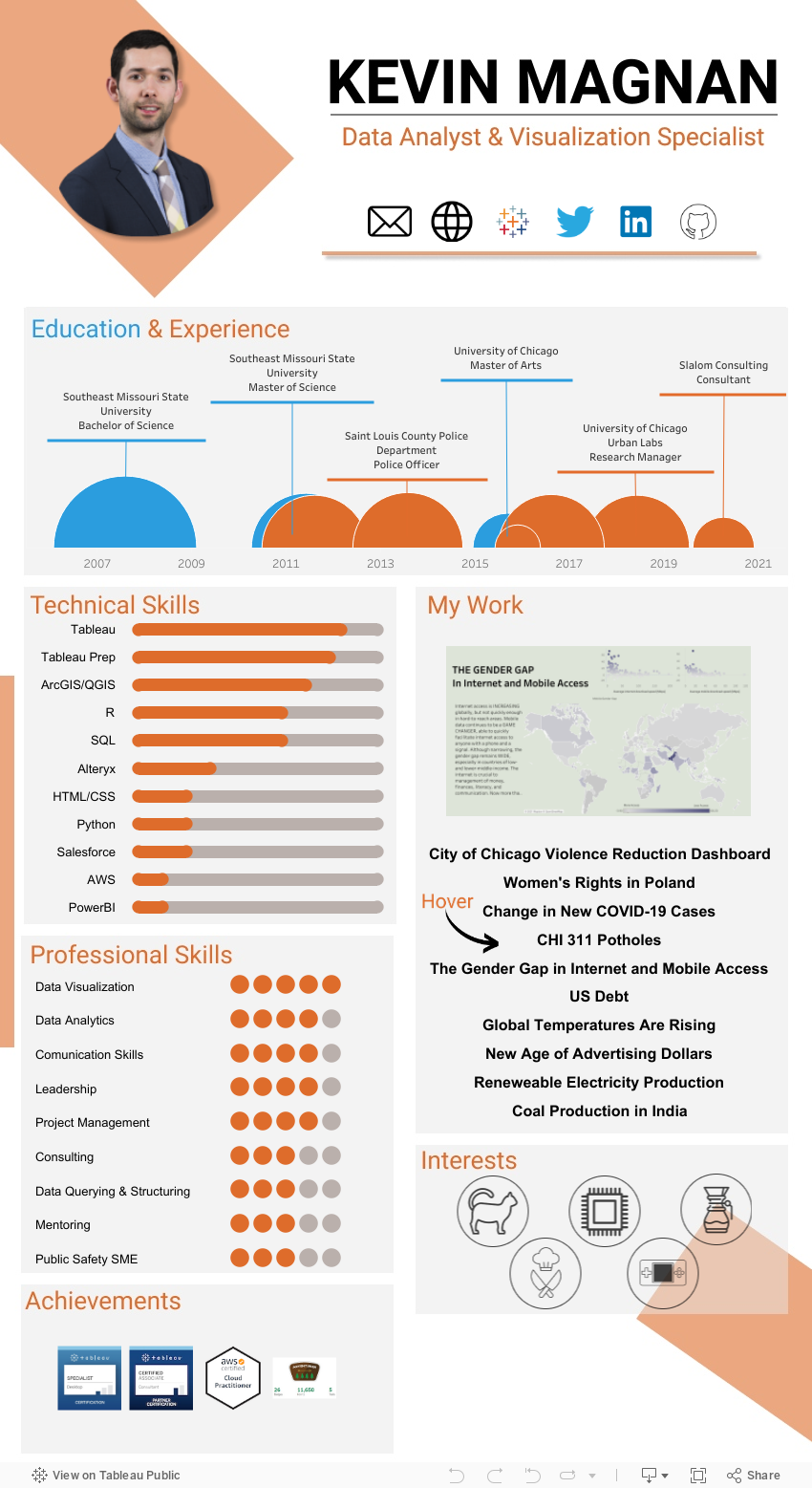
By the end of this exercise, I had sketched out my new Tableau interactive resume layout and was ready to move on to designing the content:
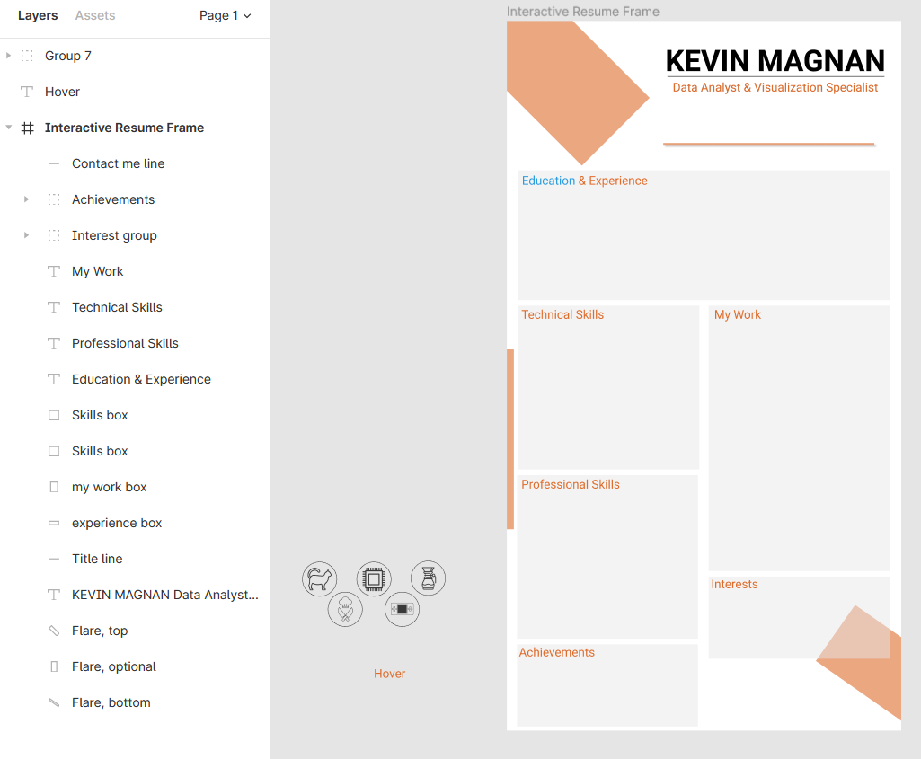
Dashboard Background Design with Figma
At this stage in the development process, you can let your creativity and inspiration thrive. I have seen countless ways to design and customize the layout and format of an interactive resume. My preferred path to achieving a custom design and background is with an online tool I recently discovered thanks to the Twitter #DataFam community called Figma. Figma is a powerful online collaborative graphics editor with tons of useful features and helpful ways to systematically and accurately design a Tableau background within a space. I have been using Figma for over 6 months on projects including my interactive resume, at work, and in my dashboards for the weekly #MakeoverMonday Tableau community challenge.
If you are new to Figma, I would suggest researching some tutorials online to get started. I recommend watching this video by Lindsey Betzendahl [@ZenDollaData](https://twitter.com/ZenDollData) as a good starting point.
For my particular Tableau resume background, I relied on Figma to create the background shapes, color scheme, icons, and text boxes. Here’s a link if you would like to check out my design!
Data Prep
Now that we have a background/shell to work with, it’s time I decided which visualizations to build for my dashboard, how the visualizations would function, and other unique aspects of an interactive dashboard like ‘Contact Me’ links, tooltips, and showcasing my portfolio. But before we get too far into the weeds on specific chart types and the iterative process of determining the best way to visualize the skills and experience from your resume, we need to talk about data prep (and data generation).
This section may raise some eyebrows but, at the end of the day, you are the judge of the skills you possess, so quantifying those skills becomes a very subjective exercise. Naturally, I would recommend being honest. The best way I found to do this was to imagine I was in an interview and was asked to justify why each skill received its respective score or expertise level.
From there, the process of generating your resume data is fairly straightforward. See the following table below as examples of where to start:
| Start Year | End Year | Institution/Employer | Role | Achievement |
|---|---|---|---|---|
| 01/01/2016 | 01/01/2018 | University A | Student | Degree A |
| 06/01/2018 | 12/01/2018 | Employer A | Intern | |
| 01/01/2019 | today() | Employer B | Analyst |
| Skill | Type | Score (out of 10) |
|---|---|---|
| Tableau | Software | 8 |
| SQL | Coding language | 7 |
| R | Coding language | 5 |
| Figma | Design website | 2 |
| Skill | Years of experience | Score (out of 10) |
|---|---|---|
| Policy Writing | =year(today())-2018 | 5 |
| Verbal Communication | =year(today())-2016 | 8 |
| Leadership | =year(today())-2019 | 4 |
From here, you’ll have enough data points to begin visualizing your quantified resume data in Tableau. A few quick things I’ll point out before moving on:
- It should go without saying these tables are rough sketches of the types of data you want to collect, you should explore other elements of your resume to gain further granularity in your skills, education, and experience
- I recommend taking advantage of Tableau’s Google Drive connection capabilities. This way your data will always remain *safe on the cloud.
- A second point on the Google Drive functionality, notice how I used a variation of the today() calculation to future-proof some data points. I highly recommend incorporating some aspect of this formula on your resume so that it continually updates as time passes. Whether or not you visualize this part of the data is up to you.
- Be sure to match up your interactive resume with your real resume. The last thing you would want is for a recruiter or job to get confused between the two documents!
For the visualization process, I relied heavily on the Tableau community and the resume gallery linked above. I spent hours experimenting with radar charts to showcase my technical skills, Gantt charts to visualize my work history and education, and switching between stacked bar charts and lollipop charts for my professional skills. At the end of the day, building these visualizations and experimenting with my resume data were extremely useful steps to arrive at my end product. Below are links to the main sources of inspiration I pulled from for my interactive resume:
Build & Publish
With respect to building and publishing your dashboard, this blog post won’t go into any detail on the technical aspects of building out the vizzes in my particular interactive resume. If that’s something I receive a lot of interest or feedback on, I will gladly write that up. In the meantime, as you are exploring the Tableau Resume Gallery, make sure to bookmark or favorite the vizzes that speak to you. When you are ready, download the workbooks and dissect how the author created the viz for you to replicate and customize with your personal resume data that we walked through above! And be sure to include some of the more unique content on your interactive resume including ‘Contact Me’ buttons/symbols, achievements and certifications with respective links, and definitely interests & hobbies! The possibilities for displaying these very personal details to you are endless and make great call-outs to your creativity!
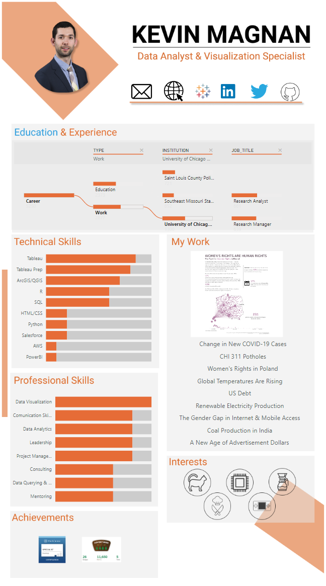
Without anymore jabbering from me, here is my Tableau interactive resume:
Link: https://tabsoft.co/3l8gOEn
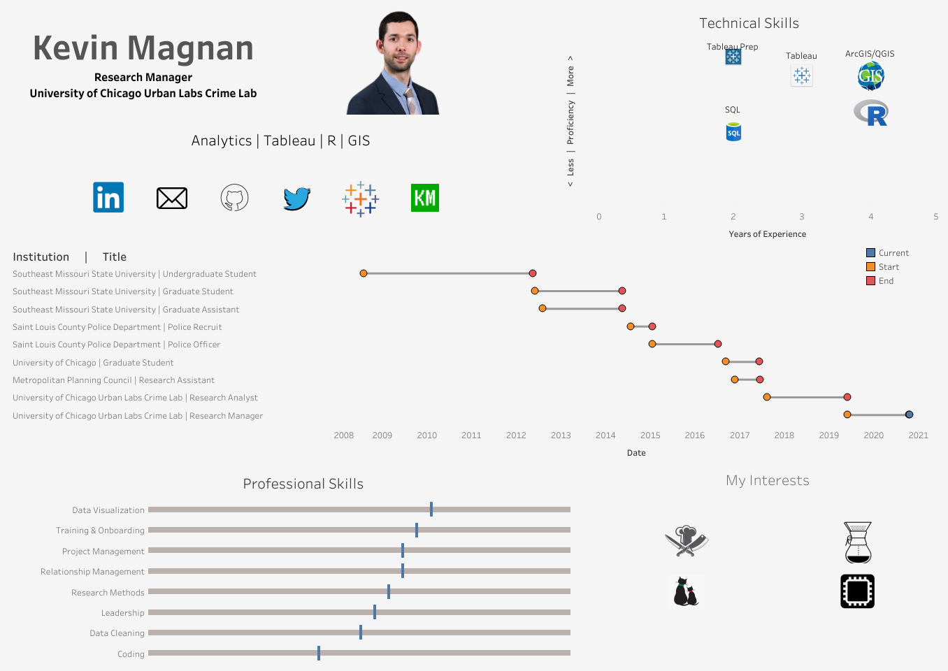
March 2021 Update:
In my quest to become more skilled in data analytics and business intelligence tools, I have started branching out from Tableau (and R) to learn Microsoft’s Power BI software/language. I recently received very useful advice on ways to incorporate Power BI into my data visualization skillset by replicating dashboards or products I have made with Tableau in Power BI. The first dashboard that came to mind was my interactive resume. As a result, I was able to, without much fuss, replicate my interactive resume in Power BI with a few minor changes and some workarounds. Here it is!